Customizing the Catalogue Template Settings
When a Website Experience is created using the Catalogue template, several template specific settings can be configured. To configure the settings for the Catalogue template, follow these steps:
- Edit the experience.
- Click Appearance and Behavior > Template Settings in the left navigation.

The following settings can be configured:
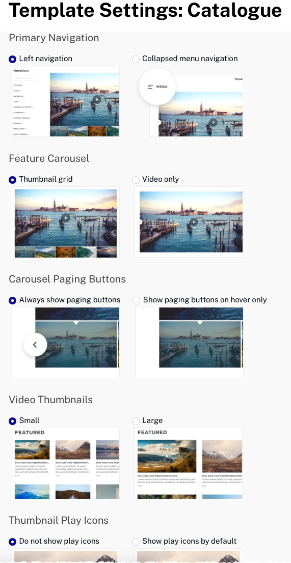
Primary Navigation
The Primary Navigation setting controls the layout of the site navigation:
- Left navigation - When there are greater than 3 collections, the collection names will appear in the left navigation. When using this option, a HOME placeholder text object will be added to the layout to allow viewers to get back to the home page. This text can be customized if needed.
- Collapsed menu navigation - A collapsible, hamburger menu will be displayed
Feature Carousel
The Feature Carousel setting controls how the videos in the current collection appear:
- Thumbnail grid - Thumbnail of videos appears below the player
- Video only - Only a single video appears. < > icons appear on the player for navigating to other videos in the collection
Carousel Paging Buttons
The Carousel Paging Buttons setting determines when carousel paging buttons are displayed:
- Always show paging buttons - Paging buttons are always displayed
- Show paging buttons on hover only - Paging buttons are only displayed when the mouse is over the player or video information
Video Thumbnails
The Video Thumbnails setting controls the size of the video thumbnail images:
- Small
- Large
Thumbnail Play Icons
The Thumbnail Play Icons setting determines whether a play button is displayed in the player:
- Do not show play icons - No play icon is displayed
- Show play icons by default - Play icon is displayed
Video Description
The Video Description setting controls the length of the video description that is displayed:
- Truncate description - Displays a truncated video description
- Show full description - Displays the entire video description
