Configuring Companion Components for an Embed Experience
All Embed Experience templates provide the ability to have companion components. Companion components include:
- Custom HTML
- Images
- Text
With companion components, content outside the player can change based on which video is playing. For example, when a product video is played, there might be a clickable image to the right of the player that will open up more details about that product. Companion components are similar to card and link interactions, the difference being, cards and links display over the video player itself. Companion components will display to the right of the video player when the video is in the PLAYING state.
Viewing companion components
To view the companion components that have been configured, edit the experience and then click Videos in the left navigation. Videos that have been configured with interactions will display an icon in the Interactivity column indicating the type of interaction(s).
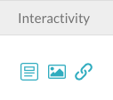
Companion components include HTML ( ), images (
 ) and text (
 ).
).
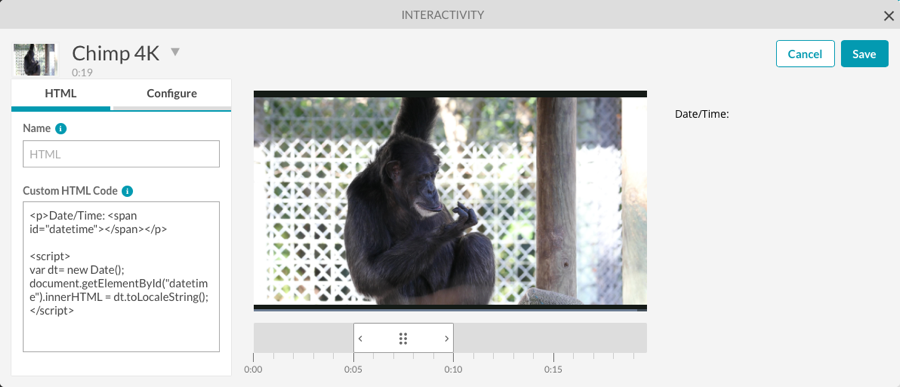
Configuring a companion HTML component
To configure a companion HTML component, follow these steps:
- Edit the experience.
- Click Videos in the left navigation.
- Click on a video to select it.
- Click Add Interactivity > Companion HTML or click on the HTML () icon in the Actions column. The Interactivity editor will open.
- Enter a Name for the HTML component.
- Paste in your HTML code.
- To configure the start time and duration for the component, click the Configure link.
- Select a Start Time and Duration:
- Show for the entire video - The component will appear for the entire video
- Select a start time and duration - You will manually set the start time and duration for the component
- Set the Duration for the component.
- Check Until the video ends if you want to set a start time only and have the component appear until the video ends.
- Check Apply this interaction to all videos in the layout if you want this component to appear on all the videos in the experience.
- Click to save the changes.
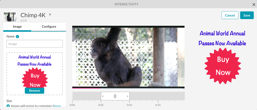
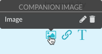
Configuring a companion image component
To configure a companion image component, follow these steps:
- Edit the experience.
- Click Videos in the left navigation.
- Click on a video to select it.
- Click Add Interactivity > Companion Image or click on the image () icon in the Actions column. The Interactivity editor will open.
- Enter a Name for the image component.
- To specify an image, you can:
- Drag an image from the file system and then drop it on the drop area
- Click browse and select an image from the file system
- Enter the URL to a remote image file
- Set the image Size.
- Image will resize to container - Images that are larger in size than the container they are in will be scaled down to fit. Smaller images will not be upscaled.
- Width and Height - Manually enter a width and height for the image
- Set the image Alignment.
- Enter a Clickthrough URL. This is the URL to go to when the image is clicked. You can also Open link in a new window.
- To configure the start time and duration for the component, click the Configure link.
- Select a Start Time and Duration:
- Show for the entire video - The component will appear for the entire video
- Select a start time and duration - You will manually set the start time and duration for the component
- Set the Duration for the component.
- Check Until the video ends if you want to set a start time only and have the component appear until the video ends.
- Check Apply this interaction to all videos in the layout if you want this component to appear on all the videos in the experience.
- Click to save the changes.
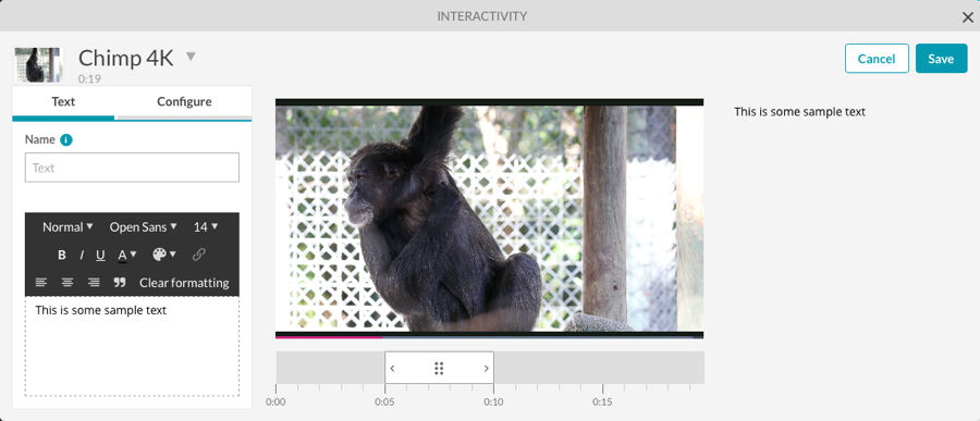
Configuring a companion text component
To configure a companion text component, follow these steps:
- Edit the experience.
- Click Videos in the left navigation.
- Click on a video to select it.
- Click Add Interactivity > Companion Text or click on the text () icon in the Actions column. The Interactivity editor will open.
- Enter a Name for the text component.
- Enter the text to add to the experience. The toolbar can be used to format the text.
- To configure the start time and duration for the component, click the Configure link.
- Select a Start Time and Duration:
- Show for the entire video - The component will appear for the entire video
- Select a start time and duration - You will manually set the start time and duration for the component
- Set the Duration for the component.
- Check Until the video ends if you want to set a start time only and have the component appear until the video ends.
- Check Apply this interaction to all videos in the layout if you want this component to appear on all the videos in the experience.
- Click to save the changes.
Editing/Deleting companion components
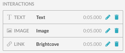
Hovering over an icon in the Interactivity column will display all the interactions of that type. In this example, an image component has been configured.
To edit a component, hover over an icon in the Interactivity column and click on the edit ( ) icon next to the component or click the video title. The Interactivity editor will open. Edit the component and then Save the changes.
To delete a component, hover over an icon in the Interactivity column and click on the delete ( ) icon next to the component.
Components can also be edited/deleted by clicking the edit icon () in Actions column. This will display a list of all the interactions for the video.
Click the edit icon to edit the component or delete icon to delete the interaction.
Companion components can also be accessed from the LAYOUT menu. Select the PLAYING state and companion icons will be displayed on the experience.