Embed Experiences Custom CSS Reference
Styled components
These CSS classes apply to items which are styled through the UI. These styles can be overridden with custom CSS by using these classes. You can also have the UI styles apply to custom HTML by using these classes. These classes are stable and shouldn’t change between template versions.
| Class | Description |
|---|---|
ee-components-style-global |
Global styling for the experience |
ee-components-style-anchor |
Normal link styling |
ee-components-style-navigation |
Navigation link styling (back button, share button, etc.) |
ee-components-style-videoInfo |
Video information box styling (non-overlay) |
ee-components-style-videoTitle |
Video title styling (non-overlay) |
ee-components-style-videoDescription |
Video description styling (non-overlay) |
ee-components-style-overlay |
Overlay video information box styling |
ee-components-style-overlayTitle |
Overlay video title styling |
ee-components-style-overlayDescription |
Overlay video description styling |
ee-components-style-overlayBanner |
Overlay banner / indicator styling (watched indicator) |
ee-components-style-playButton |
Play button basic styling (see the Play Button component for more intricate styling) |
Base components
These are basic components which can be styled using custom CSS. The component classes are stable and shouldn’t change between template versions. The inner classes are relatively stable and most likely will not change between template versions.
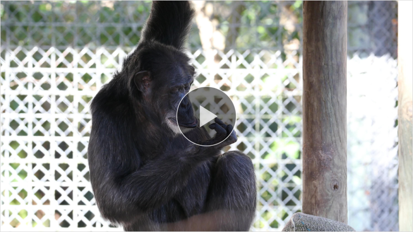
Play Button
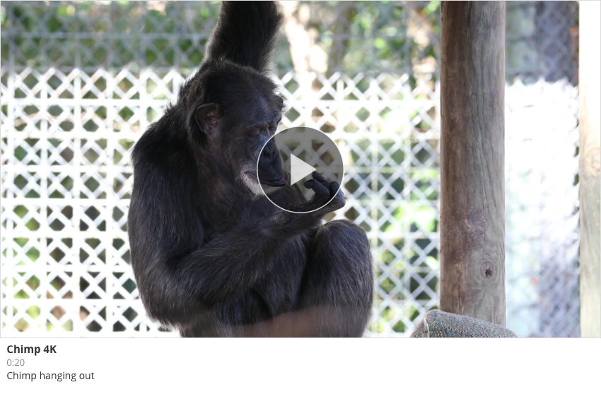
The play button appears on every video thumbnail.

| Class | Description |
|---|---|
ee-components-play-button |
Play button component |
ee-components-play-button-svg |
SVG container |
ee-components-play-button-group |
SVG inner group |
ee-components-play-button-button |
Play button SVG group |
ee-components-play-button-frame |
Play button circle frame |
ee-components-play-button-icon |
Play button icon |
ee-components-play-button-countdown |
Countdown SVG group |
ee-components-play-button-pause |
Countdown pause icon |
ee-components-play-button-text |
Countdown text |
ee-components-play-button-track |
Countdown track |
ee-components-play-button-runner |
Countdown progress |
Arrow
Arrows for the carousel template (for single and full-bleed presentation options).

| Class | Description |
|---|---|
ee-components-arrow |
Arrow component (including background) |
ee-components-arrow-inner |
Arrow |
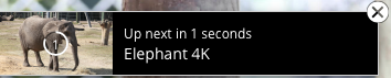
Up Next
The Up-next indicator is displayed on large thumbnails when Advance to next video automatically is enabled in the Player settings.
| Class | Description |
|---|---|
ee-components-up-next |
Up Next component |
ee-components-up-next-thumbnail |
Next video thumbnail |
ee-components-up-next-text |
Up next text (countdown + video name) |
ee-components-up-next-text-countdown |
Countdown text |
ee-components-up-next-close |
Close button |
Watched Video Indicator
The Watched Indicator is displayed when the option is enabled in the Video settings.

| Class | Description |
|---|---|
ee-components-watched-video-banner |
Watched Video Indicator |
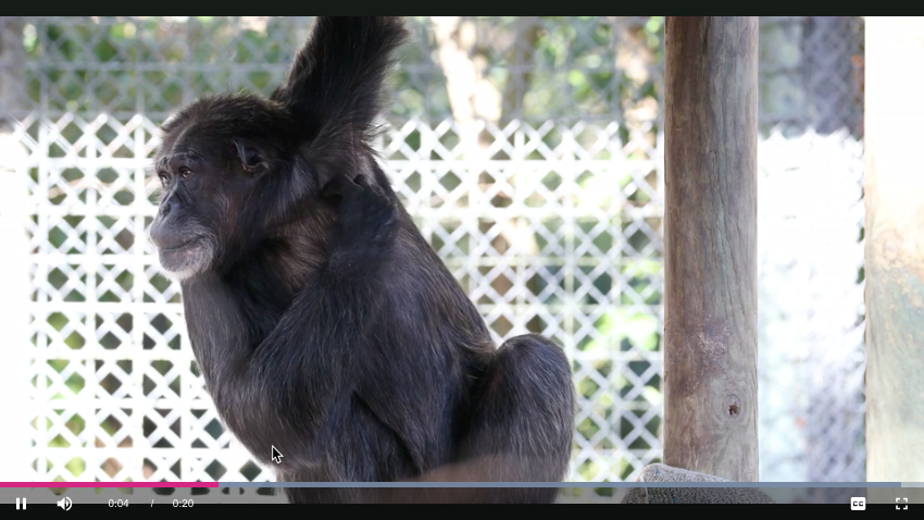
Video components
Components related to individual videos. These classes are stable and should not change between template versions.
Player
Container for the Brightcove player.
| Class | Description |
|---|---|
ee-components-player |
Player container |
Thumbnail
Basic container for video poster images (does not include the play button).
| Class | Description |
|---|---|
ee-components-thumbnail |
Thumbnail container |
Video Info
| Class | Description |
|---|---|
ee-components-video-info |
Video info container |
ee-components-video-info-content |
Inner video info container |
ee-components-video-info-name |
Video name container |
ee-components-video-info-name-content |
Video name |
ee-components-video-info-duration |
Video duration |
ee-components-video-info-description |
Video description |
ee-components-video-info-related-link |
Video related link |
ee-components-video-info-download |
Video download link |
Video Thumbnail
Contains a Thumbnail component wrapped with a Video Info component.
| Class | Description |
|---|---|
ee-components-video-thumbnail |
Video thumbnail component |
Video Collection components
Components related to collections of videos (playlists, etc.). These classes are stable and shouldn’t change between template versions.
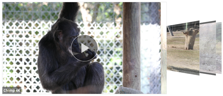
Cover Flow
Three-dimensional cover-flow presentation of videos.
| Class | Description |
|---|---|
ee-components-cover-flow |
Cover flow component |
ee-components-cover-flow-item |
Cover flow item (video thumbnail) |
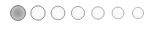
Dot Strip
A strip of dots representing each video in the list
| Class | Description |
|---|---|
ee-components-dot-strip |
Dot strip component |
ee-components-dot-strip-item |
Dot strip item |
ee-components-dot-strip-dot |
Individual dot in the strip |
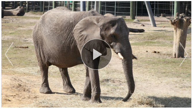
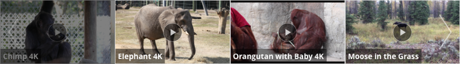
Poster Carousel
A carousel of poster images (with arrows)
| Class | Description |
|---|---|
ee-components-poster-carousel |
Poster carousel component |
ee-components-poster-carousel-container |
Row container |
ee-components-poster-carousel-row |
Poster row |
ee-components-poster-carousel-cell |
Row item (video thumbnail) |
Thumbnail Strip
A strip of thumbnail images (with arrows)
| Class | Description |
|---|---|
ee-components-thumbnail-strip |
Thumbnail strip component |
ee-components-thumbnail-strip-container |
Row container |
ee-components-thumbnail-strip-row |
Thumbnail row |
ee-components-thumbnail-strip-cell |
Row item (video thumbnail) |
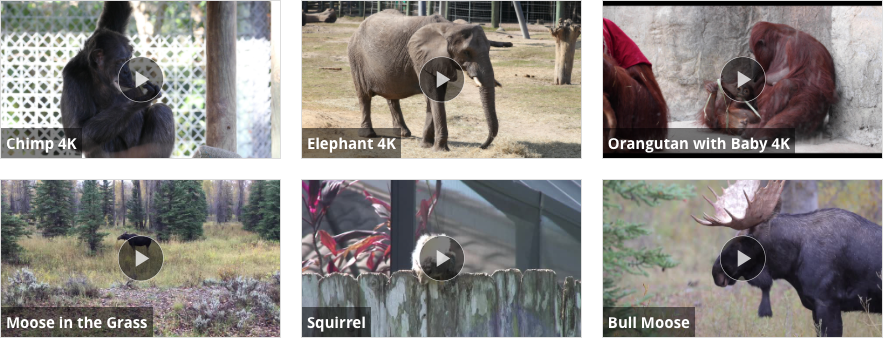
Video Grid
A grid of thumbnail images
| Class | Description |
|---|---|
ee-components-video-grid |
Video grid component |
ee-components-video-grid-cell |
Grid item (video thumbnail) |
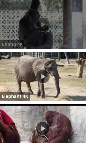
Video List
A vertical list of thumbnail images
| Class | Description |
|---|---|
ee-components-video-list |
Video list component |
ee-components-video-list-item |
List item (video thumbnail) |
Sharing components
Components related to social sharing. The Share Button classes are relatively stable and most likely won’t change between template versions. The Share Panel classes are most likely going to be changed in the near future and should be considered unstable.
Share Button
Share button or icons.

| Class | Description |
|---|---|
ee-components-share-button |
Share button component |
ee-components-share-button-button |
Share button (not icons) |
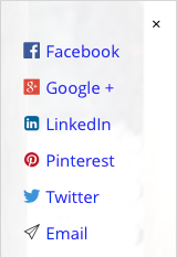
Share Panel
Sharing panel when social sharing display is set to button.
| Class | Description |
|---|---|
ee-components-share-wrapper-panel |
Panel wrapper component |
ee-components-share-wrapper-inner |
Panel |
ee-components-share-wrapper-close |
Close button |
ee-components-share-wrapper-item |
Share item |
ee-components-share-wrapper-item-name |
Share item name |
Editable components
Components which can be added to the experience via the plus buttons in the UI. These classes are stable and shouldn’t change between template versions. Screenshots for these components are not provided as their appearance depends heavily on the content entered by the user.
Advertisement
Advertisement component
| Class | Description |
|---|---|
|
Advertisement component |
Custom HTML
Custom HTML component
| Class | Description |
|---|---|
ee-components-html |
Custom HTML component |
Image
Image component
| Class | Description |
|---|---|
ee-components-image |
Image component |
ee-components-image-image |
Internal image |
Text
Text component
| Class | Description |
|---|---|
ee-components-text |
Text component |
Twitter component
| Class | Description |
|---|---|
ee-components-twitter |
Twitter component |
Global classes
These are classes which are global to the experience. These classes are stable and shouldn’t change between template versions.
| Class | Description |
|---|---|
ee-components-app |
Outermost experience element |
ee-components-view</td>
| Experience view (embed, lightbox) |
ee-components-container |
Plus-button component container |