Customizing the Style of an Embed Experience
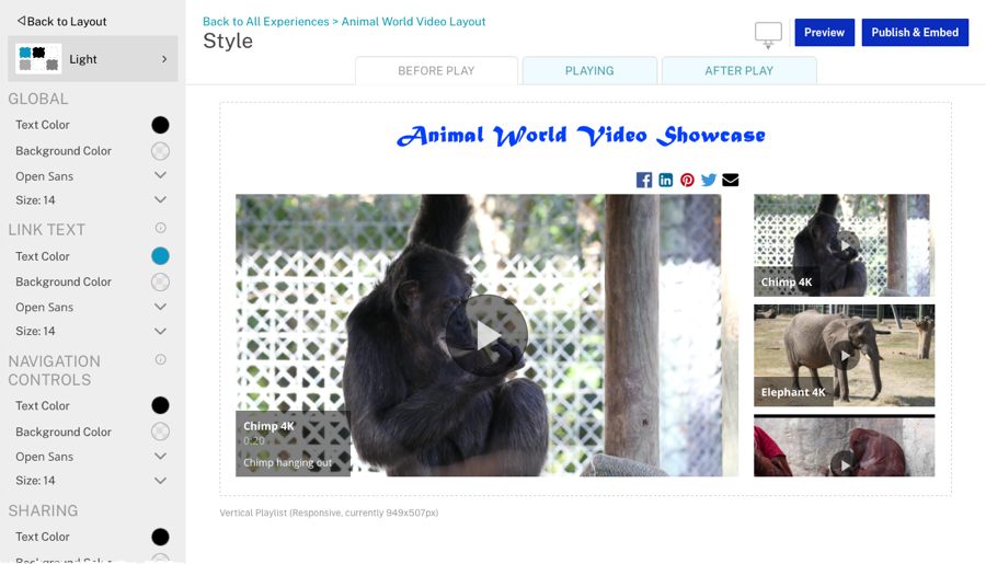
The style controls the fonts, font sizes and colors used in an Embed Experience. To customize the style, edit the experience and then click Style in the left navigation.
Switching device states
Links across the top of the page can be used to customize the styles in different device states including desktop, tablet or mobile.
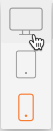
By default, the Desktop mode is displayed when customizing styles. The device states can be used to preview what an experience will look like on the selected device type.
Switching experience states
Embed Experiences have different visual states that will change as the viewer interacts with the experience. The style of each of these states can be customized by clicking the links at the top of the page.

The following states are available to customize:
- BEFORE PLAY - How the experience will appear when first rendered, before any video playback has started
- PLAYING - How the experience will appear when a video is being played
- AFTER PLAY - How the experience will appear after a video plays (assuming autoplay next video is disabled)
To style each of these states, click a state and then customize the styles as needed.
Selecting a theme
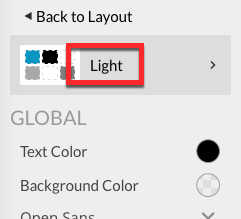
Themes provide a pre-defined set of colors and fonts which can be used to quickly style an Embed Experience. Gallery provides a set of default themes but you can also create your own custom themes that are shared across an account. Once a theme is applied to an experience, you can then use the styling options to further customize the appearance. The current theme is displayed at the top of the styling menu. In this example, the Light theme is selected.
To apply a theme to an Embed Experience, follow these steps:
- Edit the experience.
- Click Style in the left navigation.
- Click on the current theme in the left navigation to open the theme selector.
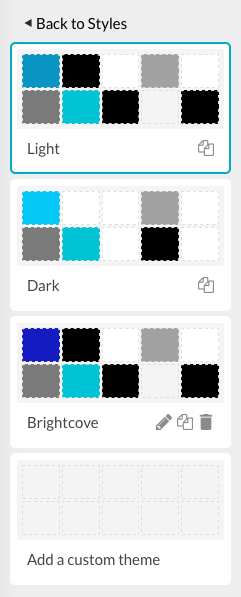
- Click on a theme to select it. The preview will update to display the theme colors.
- When done, click the < Back to Styles link at the top of the page.
Clicking the Reset default theme link will apply the default theme to the experience.
Determining which object to style
To determine which object to style, try hovering over an object on the experience. Most times, a green box will surround the object. The style for that object will become enabled and all other styles that do not apply will be greyed out. For example, hovering over the overlay description highlights both the OVERLAY and OVERLAY DESCRIPTION styles. The OVERLAY style controls the appearance of the overlay, including the overlay title and overlay description. The OVERLAY DESCRIPTION controls the appearance of the just the video description object. With overlays, the entire overlay can be styled or the styles for the title and description can be styled individually.
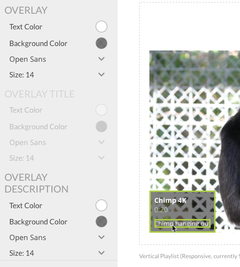
If no green box is present when hovering over an object, this indicates that the object is considered part of the GLOBAL style and can be styled using the GLOBAL styles. Text objects that have been added to the experience can be styled using the GLOBAL style unless any styles were changed using the text editor when the text was placed on the experience.
Changing styles
The styling panel is used to customize the style of objects on an experience. The styling panel can be used to customize:
A custom CSS file can also be specified.
Changing text and background color values
To select a color value, follow these steps:
- Click on the color circle to open the color picker.
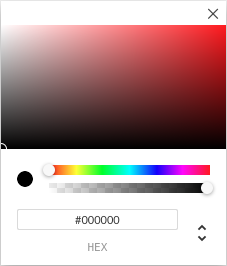
- Use the color slider to set a color range.
- Use the opacity slider to set the opacity for the color.
- Click in the color square to select a color.
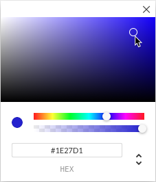
- Click the X to close the color picker.
Colors can also be specified by entering color codes:
- HEX - HEX color values are specified with: #RRGGBB. RR (red), GG (green) and BB (blue) are hexadecimal integers between 00 and FF specifying the intensity of the color.
- RGBA - RGBA color values are specified with: rgba(red, green, blue, alpha). The alpha parameter is a number between 0.0 (fully transparent) and 1.0 (fully opaque).
- HSLA - HSLA color values are specified with: hsla(hue, saturation, lightness, alpha).
Click the up/down icon ( ) to switch between the color modes.
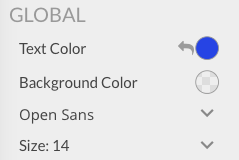
Selecting a font
The current font will be displayed in the styling panel. Use the dropdown list to select a new font. Click the X to close the font picker.
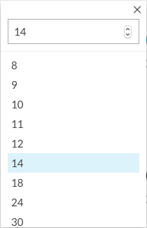
Selecting a font size
The current font size will be displayed in the styling panel. Use the dropdown list to select a new font size. Click the X to close the font size picker.
Any styles that have been changed will display an undo arrow.
Click the undo arrow ( )to reset the style to the original value. You can also reset all the styles by clicking Reset all defaults at the bottom of the style panel.
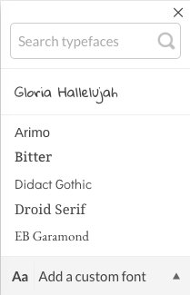
Adding custom fonts
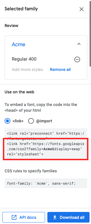
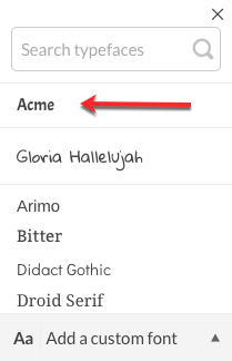
It is also possible to use custom fonts in an experience. The Google Font directory provides open source fonts that can be used on web pages. Locate a font to use (this example uses the Acme font) and then click Select this style. The font information will be displayed. The style sheet link for the selected font will be needed.
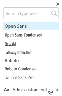
To add a custom font to the font picker:
- Edit the experience.
- Click Style in the left navigation.
- Click any of the font dropdown lists in the left navigation.
- Click on the Add a custom font link.
- Enter the URL of your custom font CSS file. Based upon the above example the URL to the font CSS file is:
https://fonts.googleapis.com/css2?family=Acme&display=swap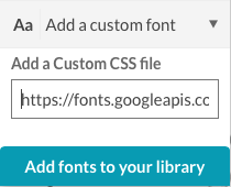
- Click Add fonts to your library.
- Verify that the font has been added to the top of the font selector.
Using a custom CSS file
To use the styles from a custom CSS file:
- Edit the experience.
- Click Style in the left navigation.
- Click Custom CSS in the left navigation.
- Enter the URL of your CSS file or paste in the CSS code.
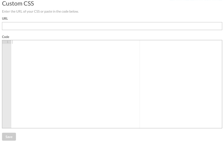
- Click .