Immersion Template 2.0
Creating a new experience
To create a new immersion website experience, follow these steps:
- Navigate to the Gallery module.
- Click New Experience.
- Immersion Website.
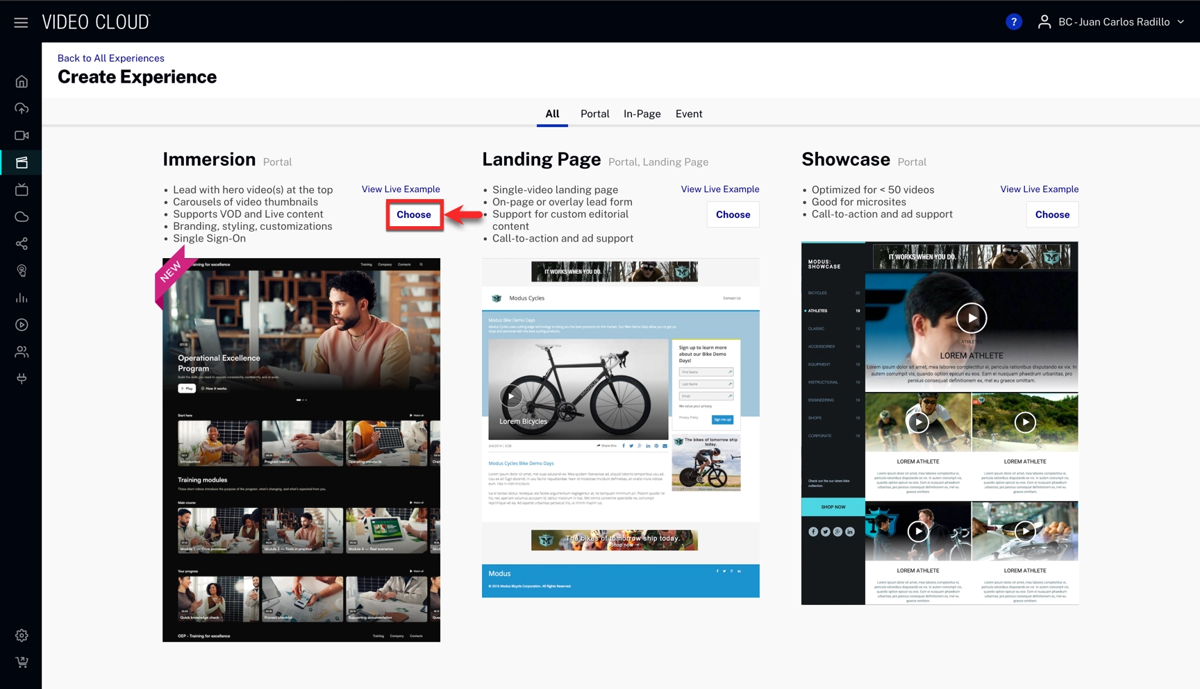
- Fill in your experience's information and click .
Pages
A page is a separate, navigable section of your Immersion experience with its own URL and customizable content layout.
To add pages to your experience, follow these steps:
- On the top left, beside Pages, click the + sign.
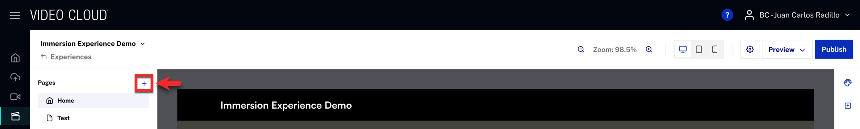
- Fill in the page name and page path.
- Click .
To delete a page:
- Click the three-dot menu icon next to the page name on the top left
- Click delete page
To rename or change the path of a page:
- Click the three-dot menu icon next to the page name on the top left
- Enter the new page name or page path
- Click Save
Linking videos to your experience
To link videos to your experience, follow these steps:
- Hover over a video section and click .
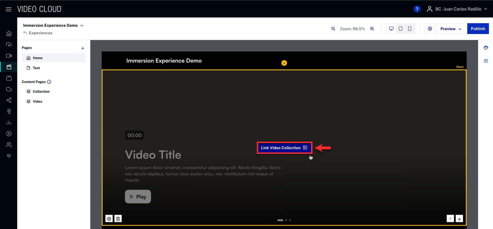
- Select or create a video collection.
- Configure your layout and playback options.
- Click Save.
Note: You can also choose videos manually by choosing the method Select Manually.
Collections
A collection is a group of videos that can be displayed together in video sections throughout your Immersion experience. Collections can be created based on playlists or by manually selecting individual videos.
Creating a Collection:
- When editing a video section, click Create Collection
- Enter a Collection Name
- Under Choose Criteria, select how you want to build your collection:
Playlist Option:
- Select an existing Video Cloud playlist
- Click the + Playlist button to choose from your available playlists
Custom Option:
- Use Parameters to filter videos and add them to your collection based on:
- Tag: Filter videos by their tags
- Name: Filter videos by title (supports "Includes", "Excludes", etc.)
- Custom Field: Filter by custom metadata fields
- Click Add Parameter to add multiple filter criteria
- Use Order By dropdown to sort videos (Most Recent, Alphabetical, etc.)
- Select individual videos from the filtered list
- Click Apply to apply your filters
- Click Create Collection
Once created, collections can be reused across multiple sections in your experience. Each collection automatically generates its own collection detail page that viewers can access by clicking "See All" or "Watch All" buttons in carousels.
Sections
To add sections to your experience, follow these steps:
- On the top right, below Styles click the add a section sign.
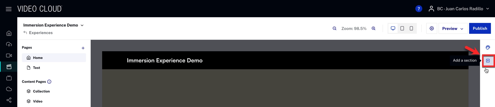
- Select your section
- You will see your new section at the bottom of the page.
To configure, click on the style icon and configure the style settings.
Video sections
Hero Section: A full-width video display that shows a single video or collection. The Hero section displays one video prominently and is typically used at the top of a page.
Carousel Section: A horizontal scrolling row that displays multiple videos from a collection. Videos appear as thumbnails with titles and metadata. Users can scroll left or right to browse through the videos. The carousel includes a "Watch All" button that links to the full collection page.
Vertical Video Section: An immersive, mobile-friendly way to engage viewers. They are designed to display video in a vertical 9:16 aspect ratio and include swipe-based navigation for browsing multiple clips.
General Sections
Headline Section:
A text section for adding titles and headings to your page. The Headline section allows you to enter text and select a heading level (H1 through H6) for proper content hierarchy. Headline sections help organize your page content and provide clear section breaks.
Text Block Section:
A section for adding body text and paragraphs. The Text Block section supports longer-form text content and can be used to provide descriptions, instructions, or any other written content on your page.
Embed Code Section:
A section that allows you to add custom HTML, CSS, and JavaScript code to your page. The Embed Code section is useful for integrating third-party content, custom widgets, analytics scripts, or any other code-based content that isn't available through the standard section types.
Widgets
Agenda Widget: A widget that displays an event schedule showing session times, titles, and descriptions for virtual events. Hover over the widget and select one of your existing agendas. See Creating an Agenda for a Virtual Event Experience for more information.
People widget: A widget that displays profiles of speakers, presenters, or team members in a grid layout. The People widget allows you to select from previously created people profiles or add new ones. You can search, select, edit, or delete existing people from your library. To learn how to create new people profiles, see Creating Event Speakers.
Customizing sections
To customize sections, follow these steps:
- Hover over a section to see the options available.
- Settings
- Delete Section
- Move the section up or down
- Select the option you want to use.
- After confirming (if necessary) the action will be reflected in the experience.
Deleting Sections
To delete a section, hover over the section and click the trash/delete icon that appears on the bottom right. The section will be removed from your page immediately.
Header and Footer
The header and footer appear at the top and bottom of your Immersion experience and can be customized to include branding, navigation, and search functionality.
Accessing Header Settings:
Click the Customize Header button that appears when hovering over the header area in the editor, or access it through the gear icon in the top right corner of the editor.
Site Title & Logo:
- Title: Enter the title text that appears in your header
- Logo Image: Upload a logo image (recommended size: 400px width, 2MB max). Click or drag an image into the upload area to add your logo
Menu Items:
Add navigation links to your header menu by clicking Add Menu Item. You can choose from three types of menu items:
- Custom Link: Add a link to any external URL with custom text
- Collection: Link to a collection page within your experience
- Page: Link to one of your experience's pages
Menu items appear in the header navigation and help users browse through your experience.
Site Search:
Enable site-wide search functionality to help viewers find content:
- Check Enable site search to activate the search feature
- Include Tag: Enter video tags to include only specific videos in search results
- Exclude Tag: Enter video tags to exclude certain videos from search results
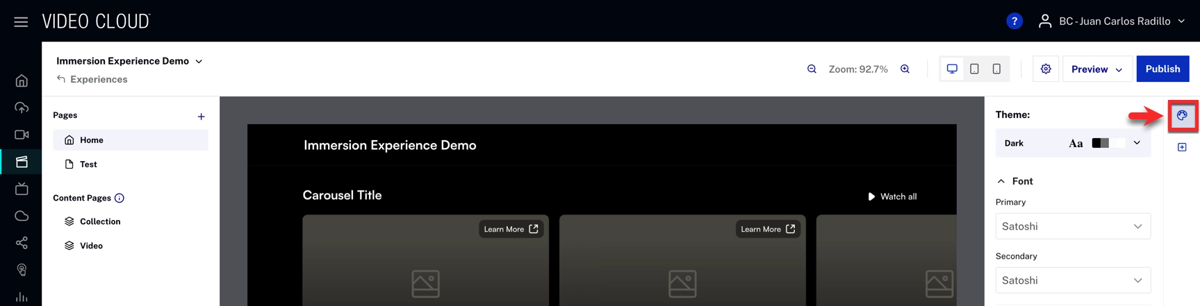
Styles
Customizing Styles:
The Styles panel allows you to customize the visual appearance of your Immersion experience. The panel is organized into the following sections:
Theme
- Theme: Choose between Dark or Light theme
Fonts:
- Primary Font: Changes the font header, footer and video titles
- Secondary Font: Select the secondary font for complementary text elements like text box and buttons
General:
Contains global style settings that apply across the experience
Duration Label:
- Background: Color of the duration label background
- Text: Color of the duration label text
Primary Buttons:
- Background: Button background color
- Background Hover: Button color when users hover over it
- Text: Button text color
- Icons: Button icon color
Secondary Buttons:
- Background: Button background color
- Background Hover: Button color when users hover over it
- Text: Button text color
- Icons: Button icon color
- Hover: Additional hover state styling
- Border: Button border color
Tertiary Buttons:
- Background: Button background color
- Background Hover: Button color when users hover over it
- Text: Button text color
- Icons: Button icon color
Header & Footer:
- Logo Text: Color of the logo text
- Link Text: Color of header/footer links
- Link Icons: Color of header/footer icons
- Link Background Hover: Background color when hovering over links
Video Elements:
- Titles: Video title color
- Subtitles: Subtitle text color
- Borders Full Screen: Color of borders in full screen mode
- Duration Label Background: Background color for video duration labels
- Duration Label Text: Text color for video duration labels
- Primary Buttons Background/Text/Icon: Styling for primary buttons within video players
- Secondary Buttons Background/Text/Icon: Styling for secondary buttons within video players
- Call-to-action Background/Text/Icon: Styling for call-to-action buttons in videos
- Tag Background/Text: Styling for video tags
Reset All Styles: Click this button at the bottom to reset all style customizations to default values.
Settings
To configure settings, follow these steps:
- Click on the settings icon.
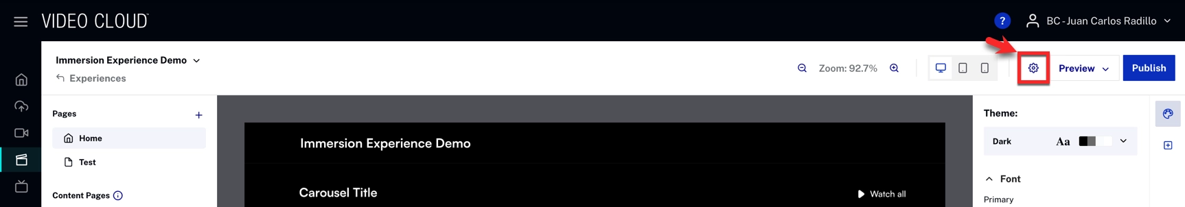
In the settings, you can configure several options for your experience, such as:
- Overview
- Player
- Access and URL
- SEO
- Third-party tracking
- Custom code
- Comments
- Configure your specific settings.
- Click .
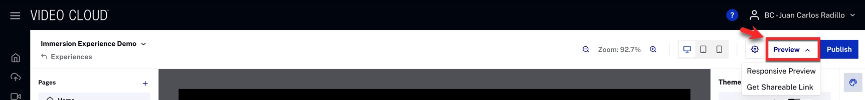
Publishing and previewing your experience
To publish your experience, follow these steps:
- Click Publish.
- Click Publish Now.
- Once the experience is published, you will be able to see the experience in the site URL.